Ideaworks Marketing Logo Trend Calendar
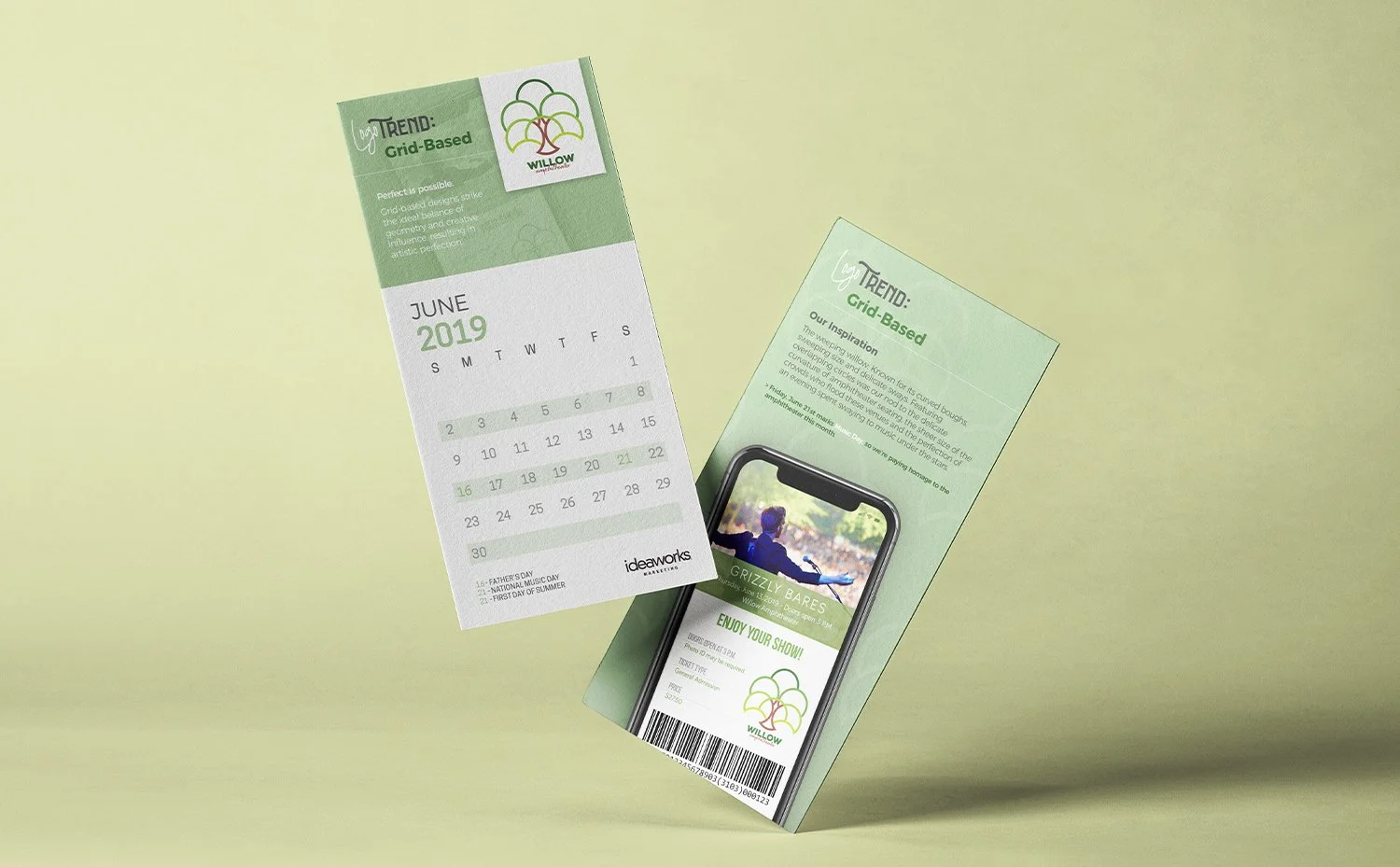
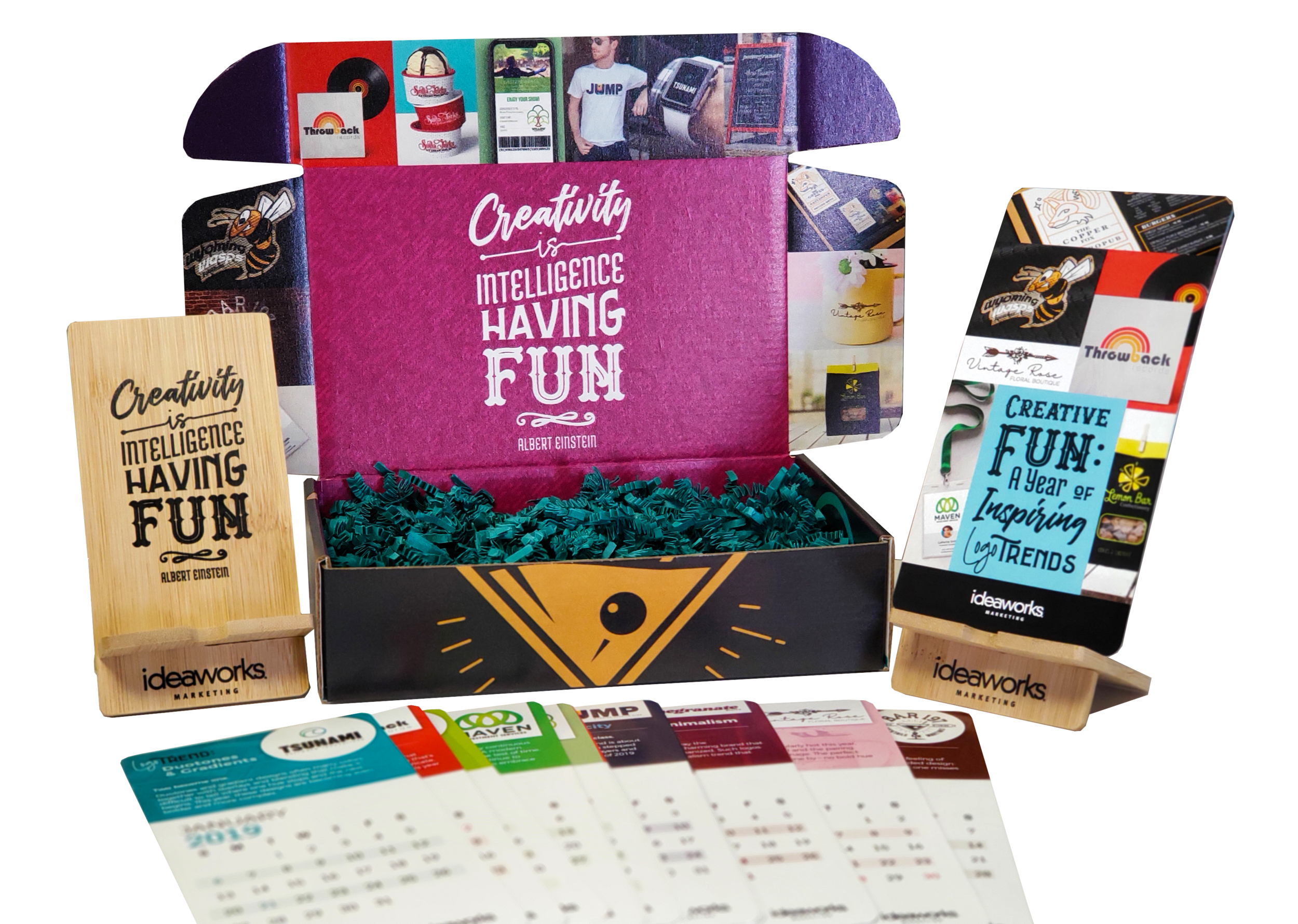
I had a large role in creating the annual calendar for Ideaworks Marketing. The company wanted to feature a different logo design trend for each month. The copywriters created fictional companies and the designers made them logos reflecting the logo trend of the month. I made four of the 12 logos (the rest made by the team), created a lot of the mock up collateral pieces, set up all of the files for printing, and worked on the box it shipped in, reflecting my art director's vision.
AAF Gold and Judge's Choice Winner 2018
-
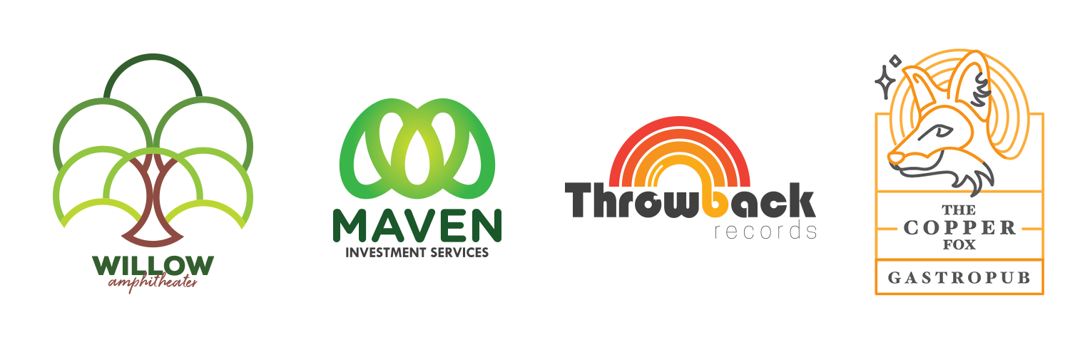
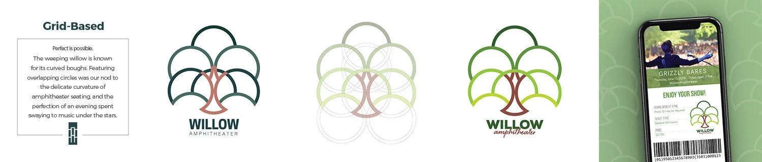
“Grid-Based” and balanced. This logo was based on the shape of an outside amphitheater, and also a willow tree of course. The trunk also resembles a music conductor.
-
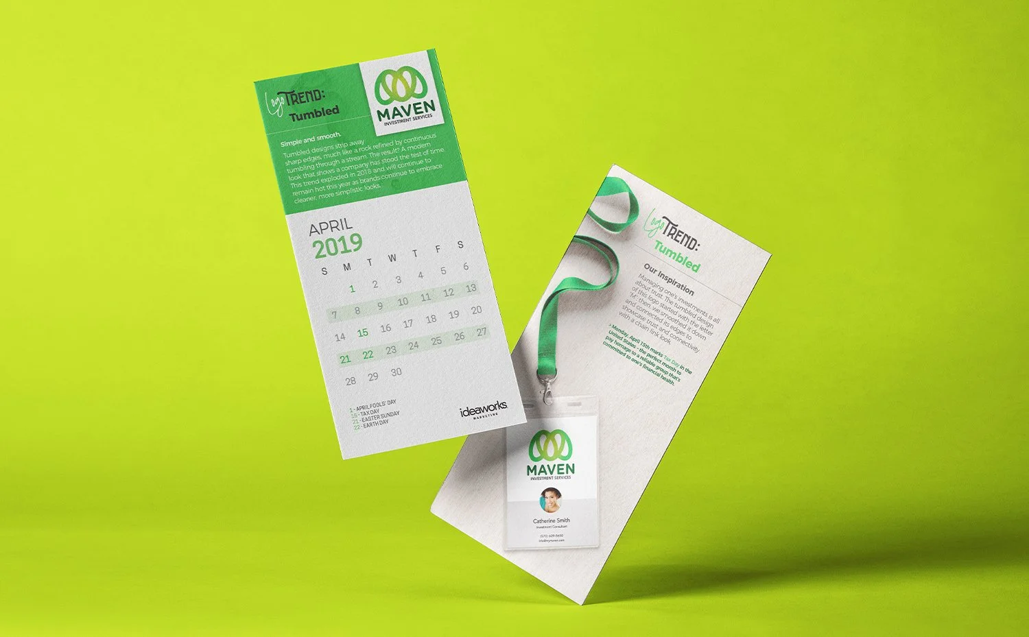
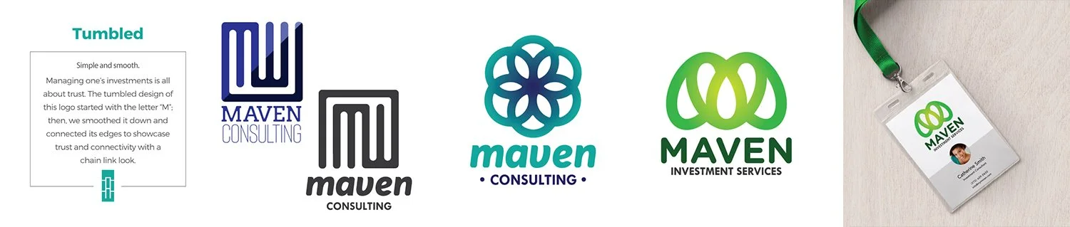
Maven is akin to the smooth, minimal corporate look. The trend for this one was “Tumbled” having no sharp edges. It took a super corporate logo and made it that much more friendly.
-
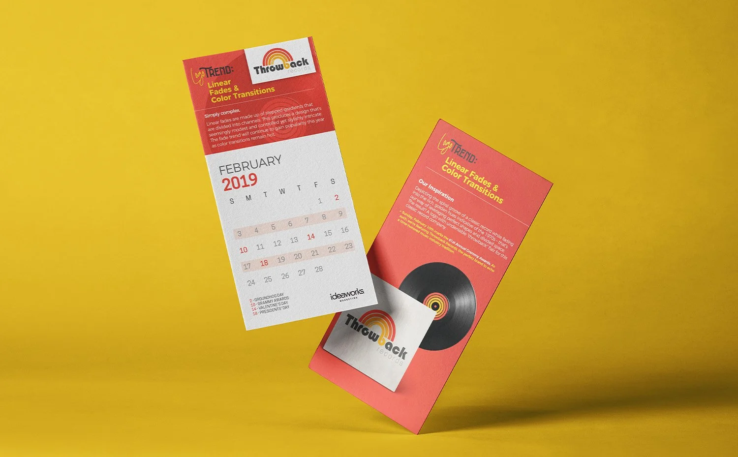
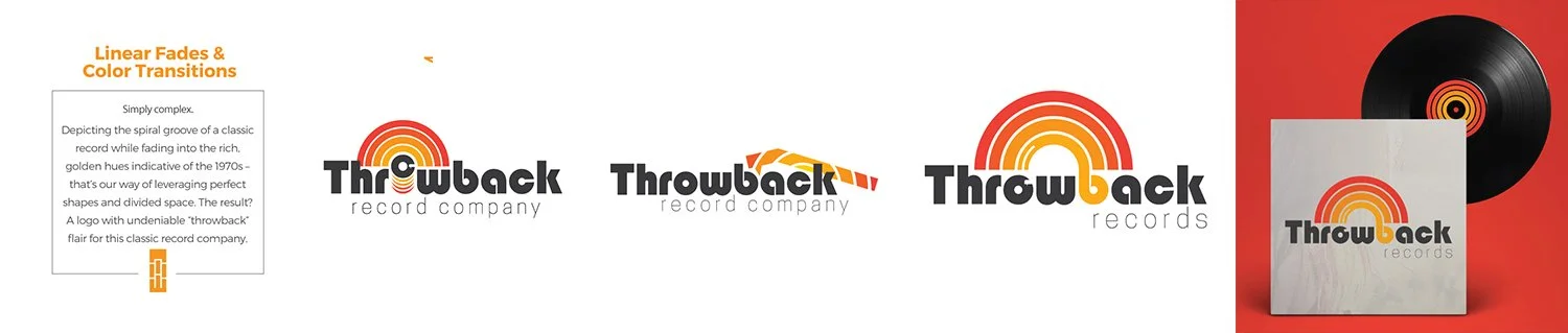
Linear Fades & Colorful transitions was the trend inspiration for this one. It fit perfectly with the 60’s nostalgia vibe that “Throwback Records” was all about.
-
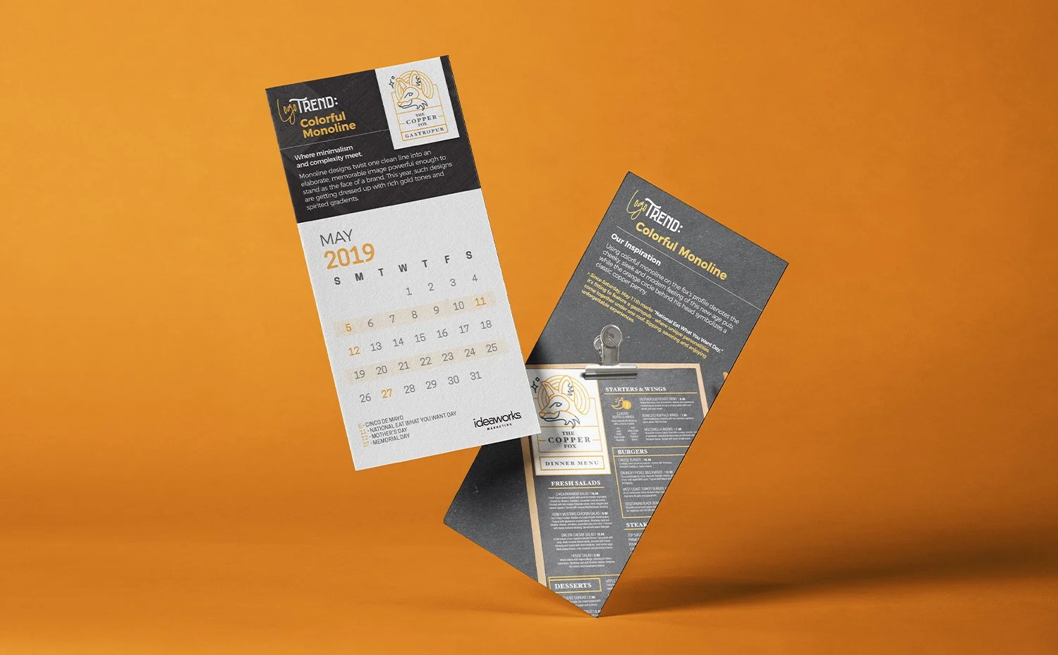
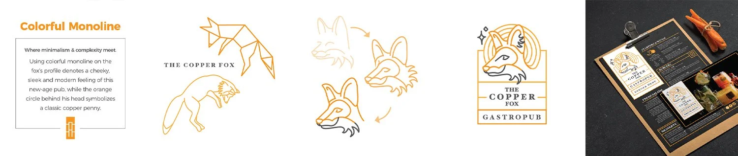
Following the “Colorful Monoline” Logo Trend for the year. The Copper Fox is a fictional gastropub in downtown Pittsburgh. Industrial, trendy and delicious!